You may have noticed that the home page of my website www.BethJones.net looks different. That’s because I changed the theme. (Yes, again! It’s fun!)

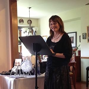
I had a Zoom meeting with my virtual assistant this week, and she quickly looked at my website at the end of the call and gave me some creative tips for the home page, using a block/grid style, with its focus more on my public speaking than writing books or coaching (which I also do).

My husband Ray and I both think it now looks more professional, will target event planners, women’s ministry leaders, and pastors about speaking at their women’s events, and it’s easier on the eyes for people who come across my site with far less text to read, more white space, and more pics. My VA said that people usually only read about 20% of what’s on your website, something that I did not know!
What do you think of the new theme? Please leave your comments below. I’m still tweaking things here (like the blog posts’ background and font colors!) and I’m hiring another VA who does graphic design to work on a sales page for me to make it look more professional and pretty. Everything else remains the same here.

You can subscribe to my newest updates and newsletter at the bottom of the home page, if you’re not already on my website personal newsletter subscriber list. You get a free gift when you sign up with your name and email address and can expect my newsletter about twice a month.
What are your summer plans? I’m praying to be able to fly to travel to Destin beach, Florida sometime this year –my fave beach! The beach is my place of happiness and peace.

Leave a Reply